hi! i’m zach.
currently: computer science & visual art double concentrator @ brown university; software engineer @ pangea.app
previously: dev team lead @ hack@brown 2021
constantly: cooking, reading, doodling, drinking coffee, and desperately trying to keep plants alive

^ that’s me!
my projects.
pangea.app - software engineering internship.
Summer 2020
I joined Pangea.app as a software engineer in June of 2020, and one of my first projects was building and transitioning both the front-end and back-end of the React Native mobile app and React web app from ‘v3’ to ‘v4’, and migrating all of the data to new schemas. While I've been at the company, I've worked on features such as sending contracts and invoices, integrating with Stripe API, and building out a beautiful and effective real-time chat using WebSockets. I'm staying on at Pangea.app part time as I go back to school in the fall, and I'll be updating more on my project work here!
• • •
wiseUp - an nlp-based studying platform.
Spring 2020
Along with three of my classmates (and best friends), we created WiseUp as our independent final project for our Spring 2020 Software Engineering course. WiseUp is a collaborative studying platform that allows users to create decks of flashcards and share them with friends, but most importantly, what makes WiseUp different from any other platform is its intelligent use of natural language processing for semantic similarity evaluation. With WiseUp, users don't need to memorize the exact definitions on their flashcards. Instead, the program paraphrases and analyzes the key parts of definitions, and matches meaning to similar statements. WiseUp has a Java & Python backend and a Javascript frontend.
Our premise was simple, studying flashcards can be a fantastic resource for students, but often this method of study can just reinforce rote memorization of exact definitions, which doesn't actually help students learn in their own words. When asked to rephrase what they've learned or explain a concept as if teaching someone, it is essential that students can really internalize a concept. That's why we decided to create WiseUp. We feel that instead of memorizing exact syntactical definitions, the best form of studying is explaining concepts in one's own words, so we built a platform to allow just that.
Features
We wanted the user experience of WiseUp to be clean, satisfying, and easy - studying doesn't need to be any more difficult or anxiety inducing than it already is! For this reason we made our account creation process as streamlined as possible, containing one page for information input and an email verification that links directly with your code already input.
Continuing the same ease of use through the app we kept everything as clean and simple as possible, making sure accessing and creating decks was only one or two clicks away wherever you are in the app.
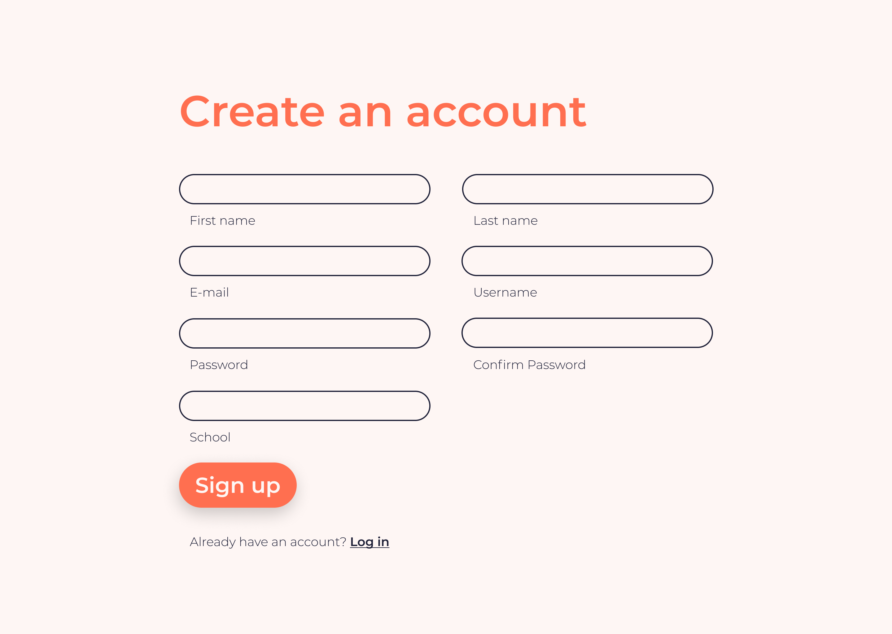
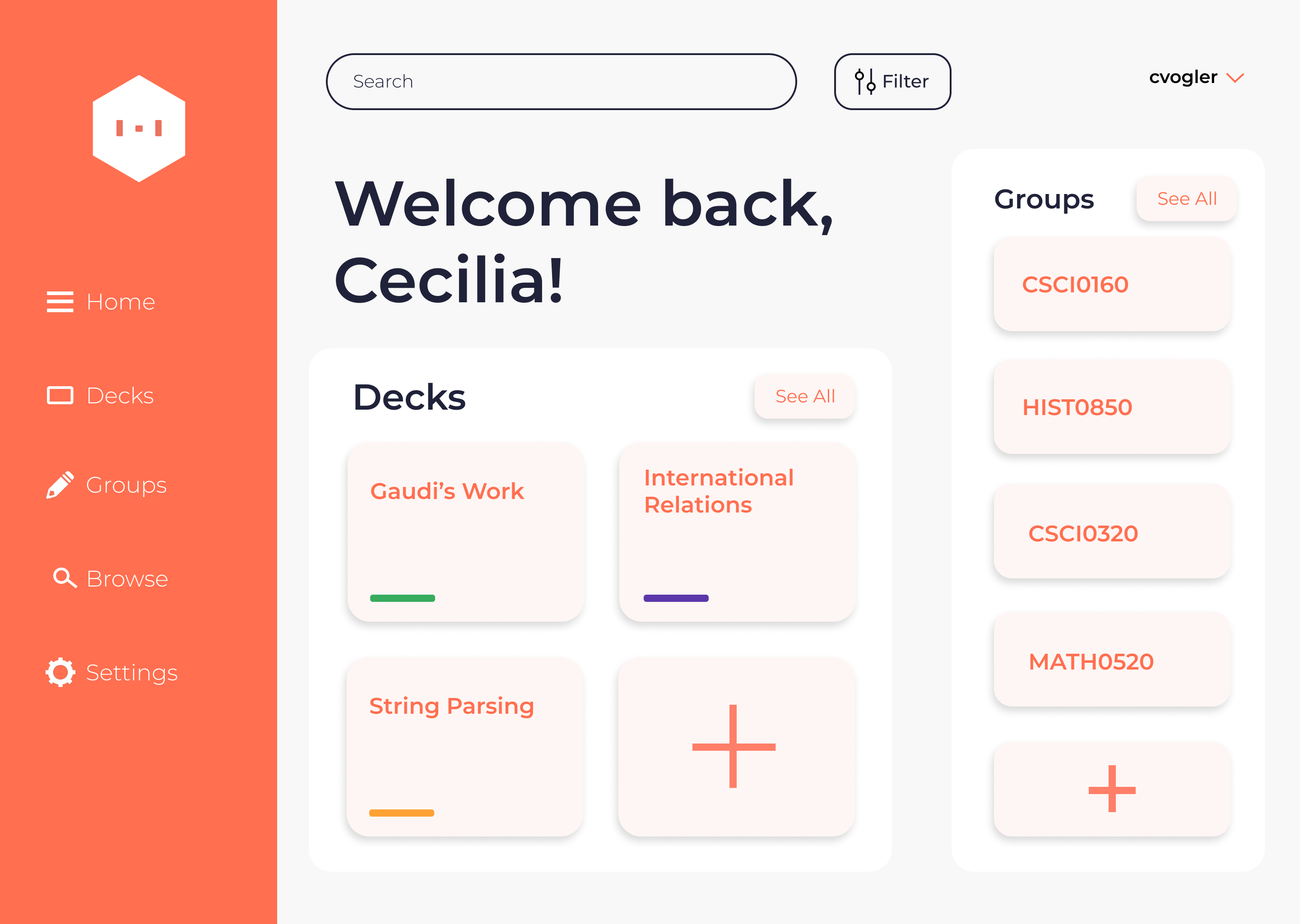
left: create account page, right: user home page
Collaborating on studying has also never been easier, as decks can be made public or private, and users can share decks with friends so that multiple users can create and edit cards. We also built out a study group functionality, in which all decks created in the group are shared and collaborative to every member. We also included search & browse functionality, so that users can search through all public decks, with suggested autocomplete on their searches, so that finding a study deck filled with exactly the information you need is just a few keystrokes away.
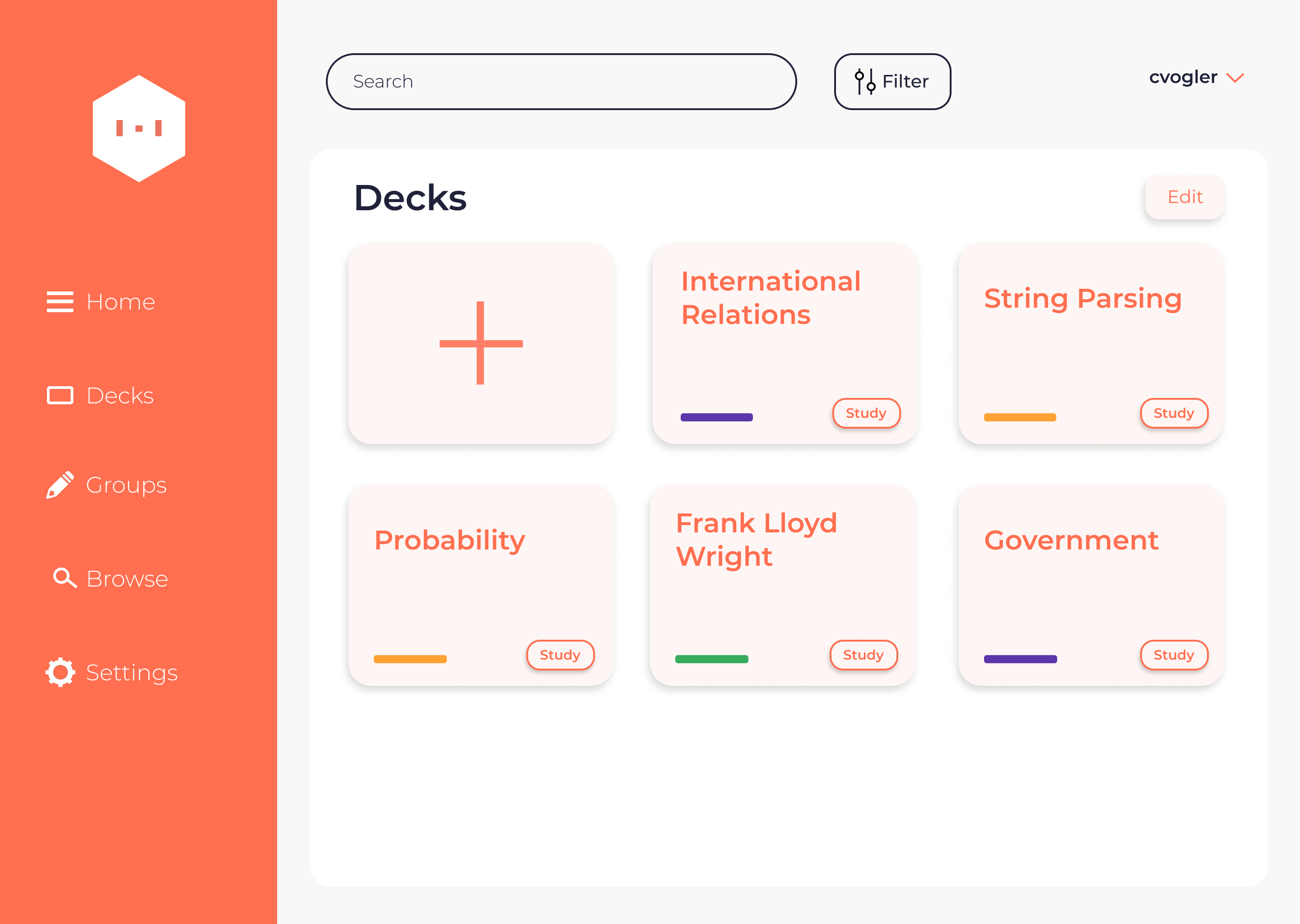
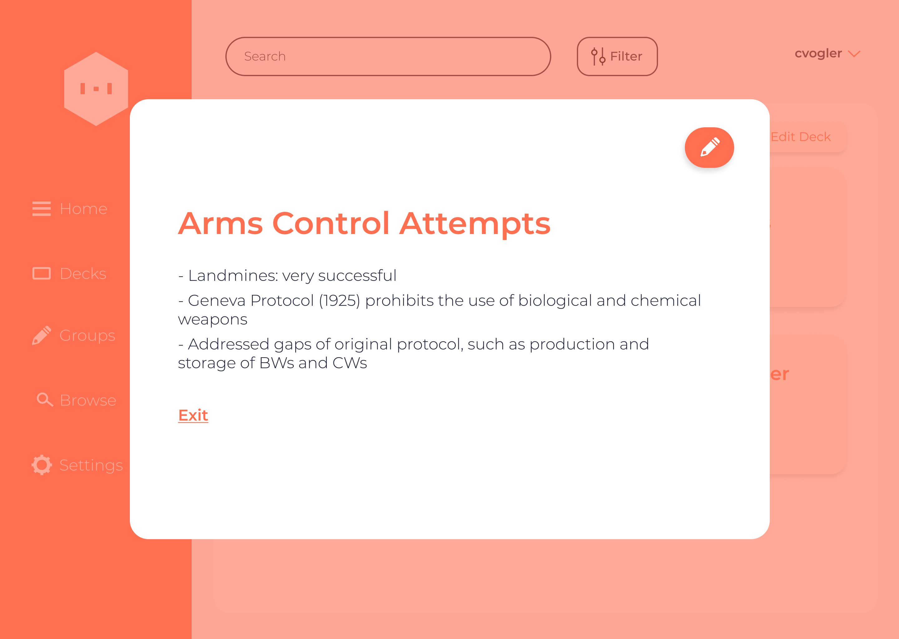
left: user decks page, right: single study card
Finally, our pièce de résistance is our ‘evaluator’. Again, our focus was to make it feel like the user was simply explaining a concept to a user, so we built a chat-bot for the user to study with! The bot asks users to explain different concepts, and prompts them with hints to steer them in the right direction if they get off course. Studying feels like a conversation with a friend who can see the definitions and is helping to guide you toward them.
Implementation and Backend
The foundation of the backend of this project was built in Java. We stored all of our user, group, deck, and other data in an online-hosted database to preserve information, and we queried the data using SQL. We also leveraged a Java email-sending framework to send our verification and forgot-password emails to users.
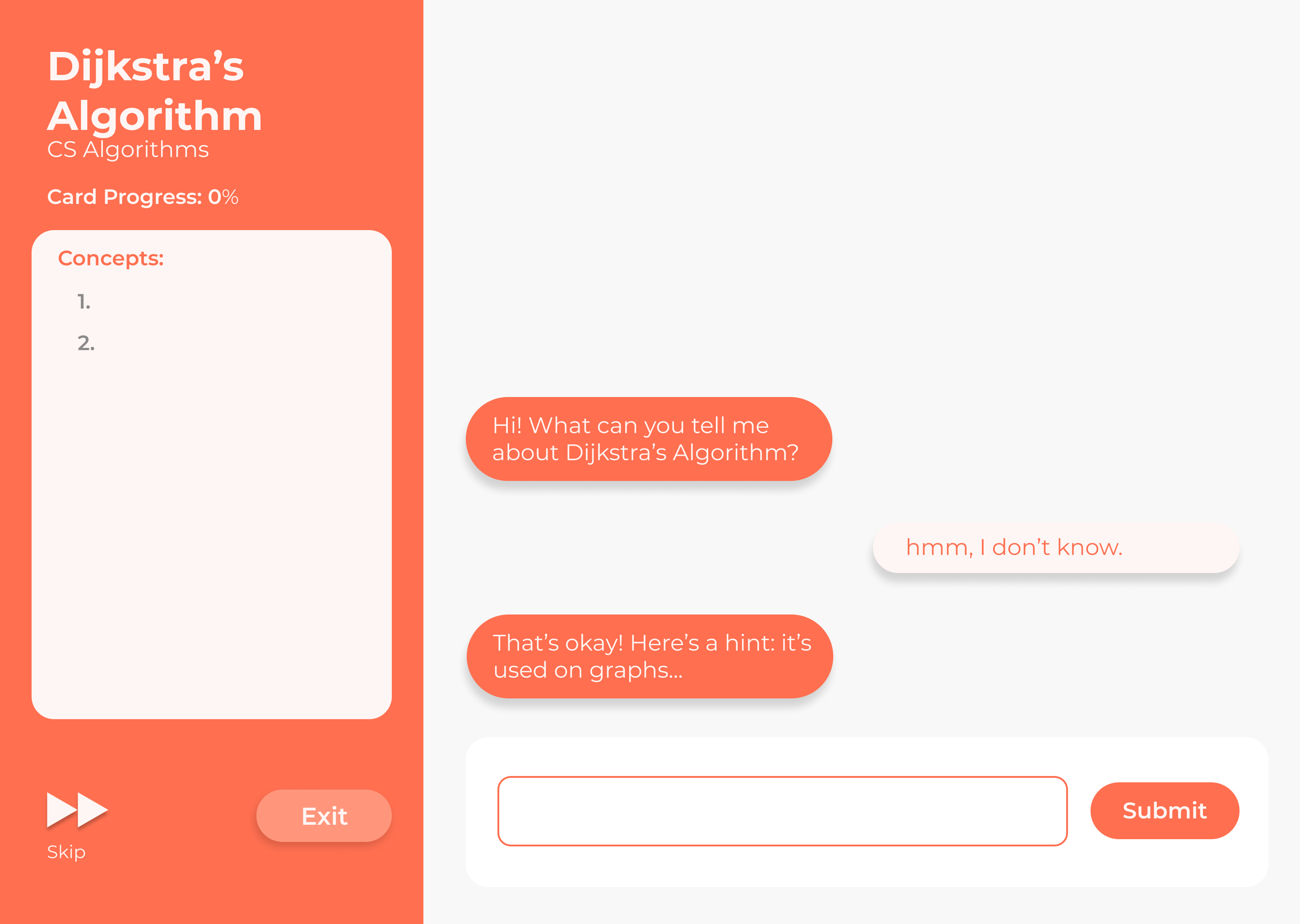
studying chat-bot interface
The largest and most important section of our backend drives our evaluator. This is split up into two parts, one in Java, and one in Python, which run synchronously using threads to optimize runtime. In Java, we implemented an algorithm called RAKE, which allowed us to split up input sentences and paragraphs into key words and phrases, using common English stop-words and punctuation as delimiters. There are many edge cases in the English language, however, so the algorithm had to be robust enough to be versatile, but no too complicated such that it overfitted the inputs. We then used Java to analyze direct matches between the key phrases and words, and also parsed out numerical phrases and matched them strictly.
In Python, while the Java was analyzing direct matches, we used a pre-trained BERT neural net model that was finetuned on the Microsoft Research Paraphrase Corpus datase to analyze indirect, semantic matches. Using this model we were able to account for word order, synonyms, and other semantic similarities with syntactical differences.
With our robust, multi-faceted backend, and our sleek, easy to use frontend, we created the solution to all of our flashcard-studying woes. This project completely changes the idea of flashcard studying from a lonely act of rote memorization, to a collaborative teaching and learning effort.
• • •
repairing repairs - a google design challenge.
February 2020
“Repairing Repairs” is a UI/UX design challenge I executed in one week during the application process for a Google UI/UX Designer Summer Internship. The final interactive prototype of the staff interface can be found here and the student interface prototype can be found here. For my complete design process, please read on!
As a brief introduction, my name is Zachary Mothner, and I’m a student at Brown University studying computer science and visual art. As a member of a university community, and unfortunately sometimes an encounter-er of broken objects, I’ve had some experience using interfaces for filing service requests. For my design challenge, I chose the prompt:
Your school wants to improve the upkeep of campus facilities by creating a new system for reporting any facilities that may need maintenance or repair. Design an experience that allows students to report building or equipment issues on campus. Consider the process of those filing the report and of those receiving and taking action on the issues.
Identifying Users, Needs, & Goals
I began my design process by creating a list in my sketchbook of users of a facilities reporting and management system, and then identifying each category of users’ potential needs, and my goals for solving those problems. I identified two user groups: students — as ‘reporters’ & staff — as ‘responders.’
“students — as ‘reporters’ & staff — as ‘responders’”
I then listed all of my user groups’ needs and problems. For students I decided their two main needs were 1. reporting new issues, and 2. tracking their requests after reporting. I identified students’ main problems as complexity/lack of usability of the interface and lack of connectivity with staff solving the issue. After speaking with some facilities staff members from my school (because who knows their needs better than they do?), I identified staff needs primarily to be seeing issues as they come in from students, and claiming and responding to requests in as organized a fashion as possible. Many staff problems came from lack of usable interfaces, organization, and miscommunication or misinformation from students. I also decided at this stage to include a page on ‘trends’ so that staff workers could see the data from the past week, month, year, etc. and know what kind of issues were logged most, took longest to fix, etc. I was then ready to move on to my next step, sketching and wireframing.
Sketching and Wireframing
With my problems to solve now identified, I began sketching out preliminary ‘screens’ for how each user group’s experience in the app should look. I knew I wanted to focus on accessibility, cleanliness, communication, and organization above all else.
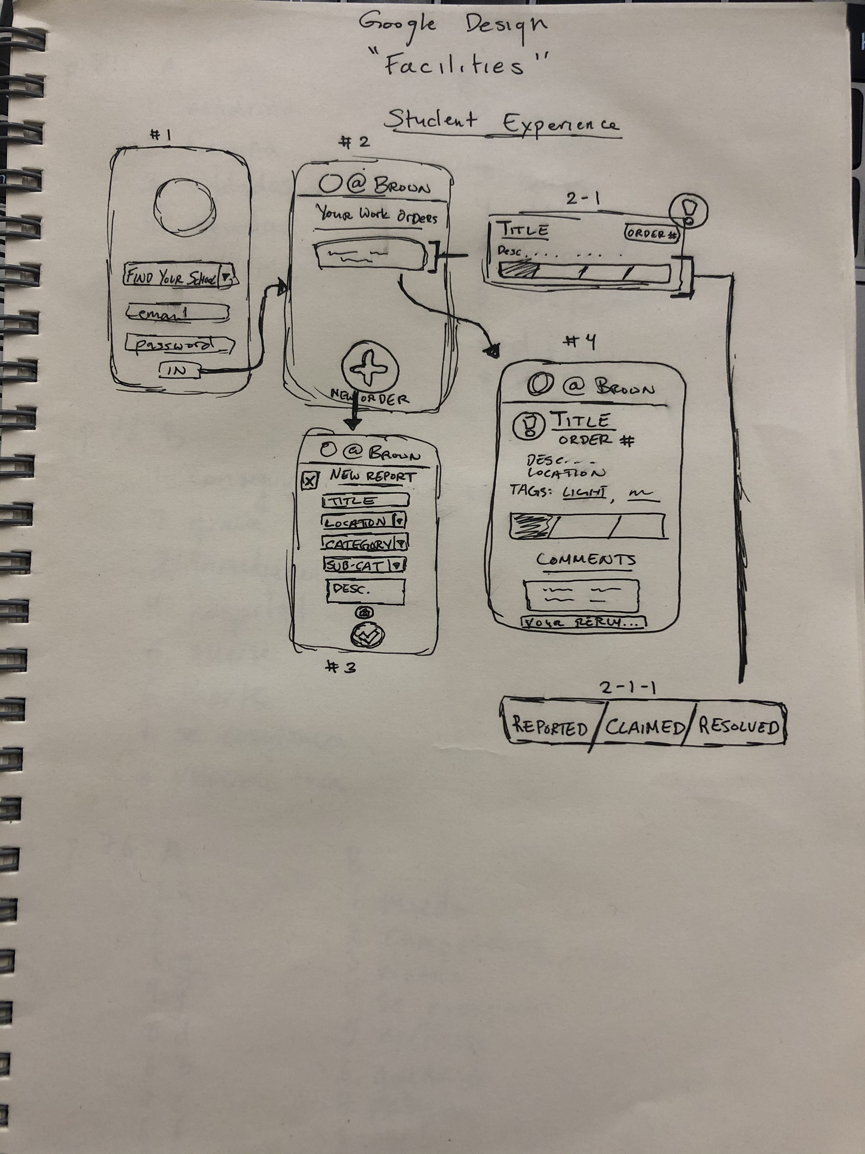
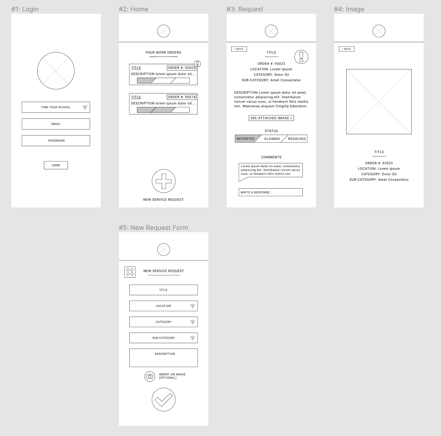
from sketches to wireframes — the student experience
Student Experience:
For the students, I sketched out a login screen, a home screen displaying the currently logged service requests, a detail screen of one service request, and a form for logging a new request. In the form, to make sure I was solving my identified problems, I included text/dropdown menus for categories and subcategories of work order, as well as campus locations, so that all options would appear on click, but users could also type and the available options would shrink to relevant results. This kind of input is important to my design because the options allow users to not need to know exactly what categories the staff use to organize issues going in, but the typing allows users to not need to scroll through every option to find the correct one. I also included a part of the form where users can add an image of the broken object to better help staff understand the issue. On the main page, the status bar of each task is displayed so that students can check on the status of their request, and there is a comment/follow-up section within the details page (with notifications on the main page) so that staff can ask for more information through the app, and students can clarify if necessary. My full wireframe interactive prototype for the student experience can be found here: https://www.figma.com/proto/Q5CmOOcBXv4epYR2LrO3XJ/Untitled?node-id=1%3A2&scaling=scale-down
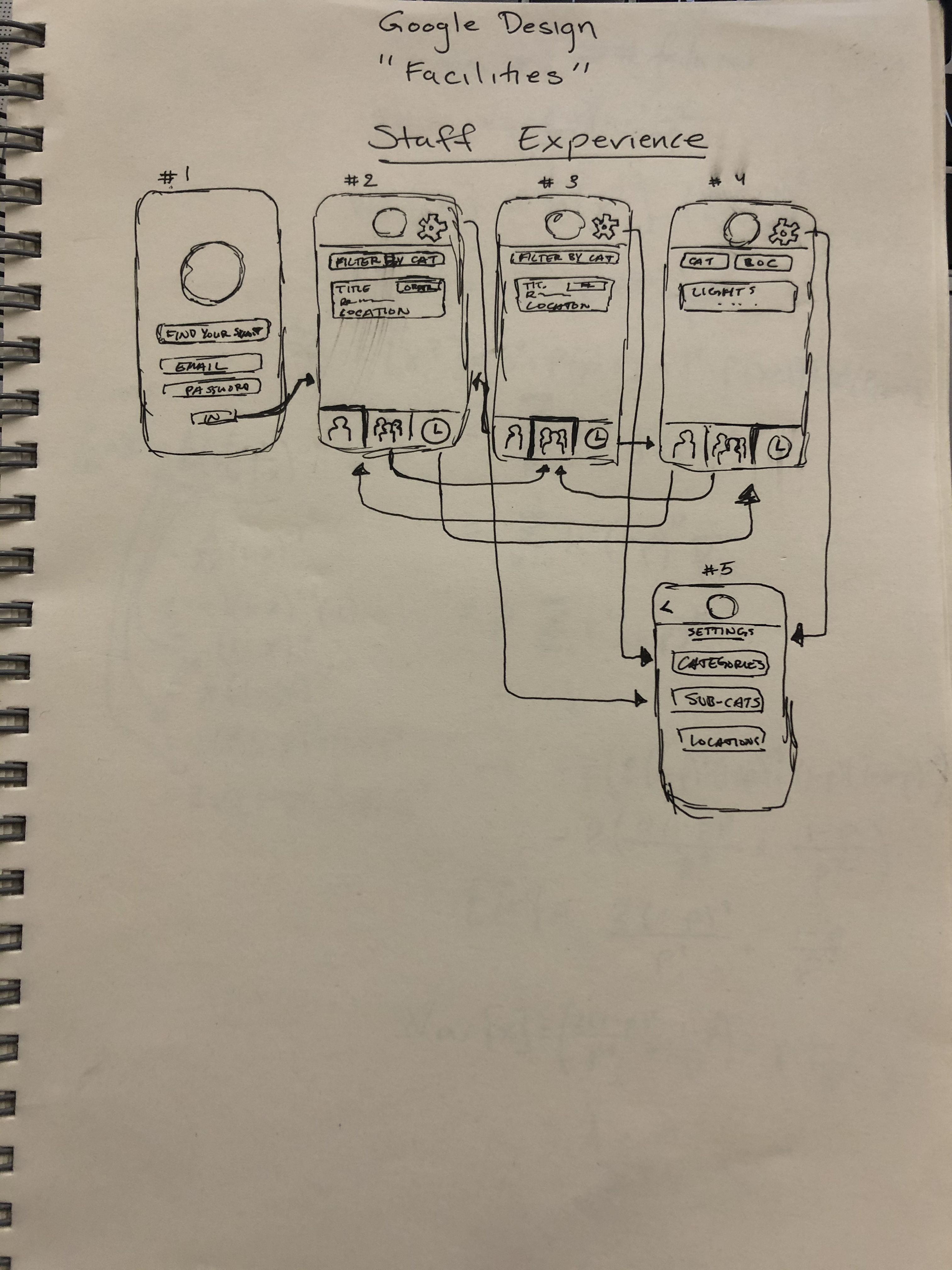
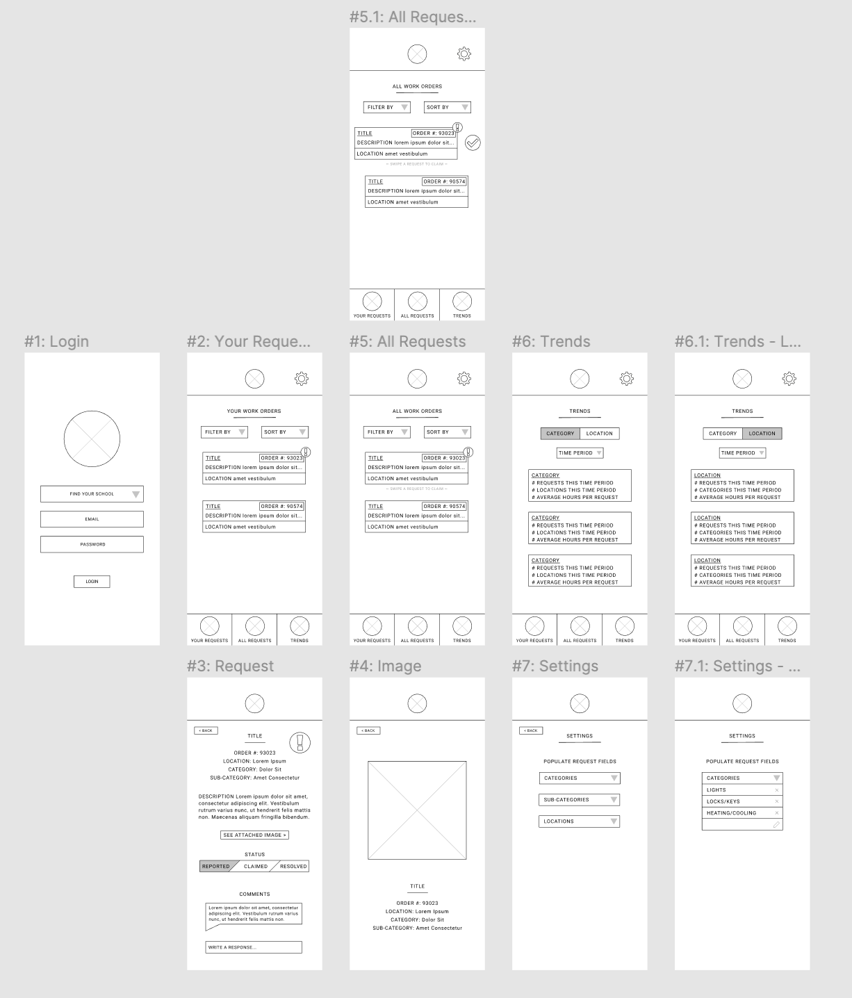
from sketches to wireframes — the staff experience
Staff Experience:
For the staff experience, I realized that there would be three main pages that are equally important and serve parallel purposes: “Your Requests” — where staff members can see requests that they personally have claimed, “All Requests” — where all requests can be seen and new ones can be claimed, and “Trends” — where the data passed through the app is collected and presented to help improve the entire process. I decided to use a toolbar at the bottom of the screen so that all three of these pages could be accessed always, and the navigation was as easy and clear as possible. I also made sure to include filtering and sorting on all of these three pages, so that staff members could reduce clutter and get the most essential information quickly. Finally, I realized that staff would need to be able to populate the dropdown options that students use in the reporting form, so I included a settings page in which staff members can change the available categories, sub-categories, and locations. My full wireframe prototype for the staff experience can be found here: https://www.figma.com/proto/Q5CmOOcBXv4epYR2LrO3XJ/Untitled?node-id=90%3A215&scaling=scale-down
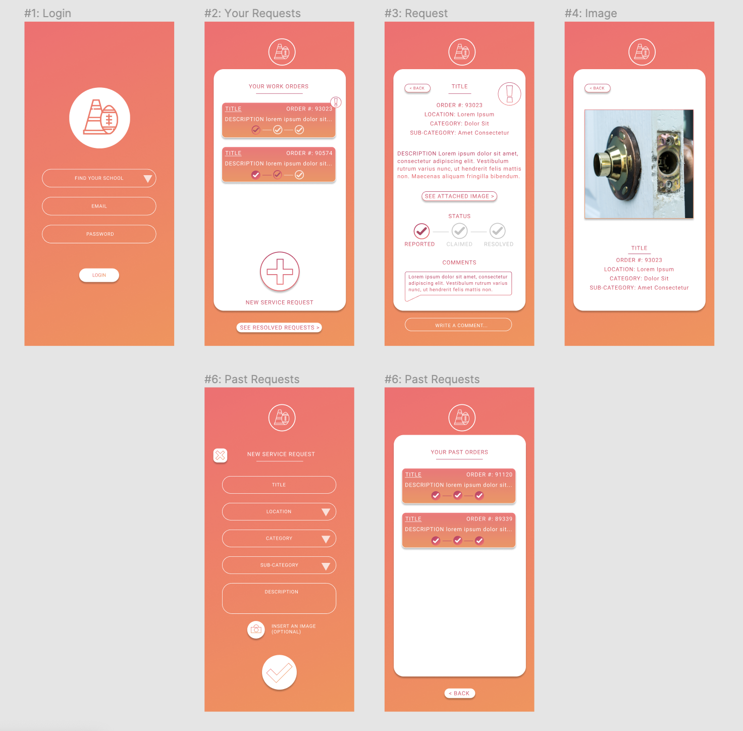
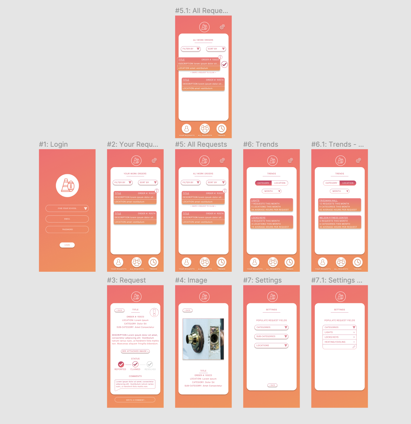
left: final student interface, right: final staff interface
High-Fidelity: Colors, Graphics, and More!
As I discovered through iterating in the wireframing process, the staff experience was more robust, so that’s where I started for developing the high-fidelity experience. I knew for both students and staff, I wanted to use a color palette and shapes that were both clean and made for an enjoyable experience. I chose to use white as the main backdrop for most of the text so it was readable and clear, but splashed a colorful gradient behind to bring life to the project. I added more functionality as I realized I needed it, for example factoring out students’ resolved requests into another easily accessible page so as not to clutter the main screen but to still allow students to see the history of their own use within the app.
My full high fidelity prototype for the staff experience can be found here: https://www.figma.com/proto/Q5CmOOcBXv4epYR2LrO3XJ/Untitled?node-id=109%3A75&scaling=scale-down and the full high fidelity prototype for the student experience can be found here: https://www.figma.com/proto/Q5CmOOcBXv4epYR2LrO3XJ/Untitled?node-id=130%3A293&scaling=scale-down
Were I to continue fully developing the app and implementing it, I would build out the sorting and filtering capabilities as well as the dropdown/text menu functionality, and distribute the interface to peers and also staff members to conduct testing for any needs or problems I may have missed.
• • •
maps visualizer - software engineering course project.
March 2020
In this project for my Spring 2020 Software Engineering course, I built a maps visualizer using a Java backend and Javascript frontend, and using SQL queries to read data from a SQLite database containing road info from Open Street Maps. Features implemented include shortest-path directions, nearest traversable way, nearest-neighbor search, and autosuggest as interactive elements to the map interface.
Features
This project allows users to load in any map they like, as long as they have the Open Street Maps data. For development, I used a map of the state of Rhode Island. Upon opening the web app, the frontend draws the roads and other map information (such as buildings) within the initial scope of the viewport.
When the user drags to pan or pinches to zoom in or out, the map will automatically adjust and load the newly necessary road information from the SQLite database using a cache system to optimize efficiency. The user can also click any two points on the map, and the application will display the shortest traversable path between those two points.
In addition to simply clicking points on the map, the user can instead input two intersections into the interface at the top-right of the screen, and the map will draw the shortest path automatically. Should either of the two points be out of the scope of the viewport, the map will zoom out and load the necessary data such that it can display the complete route. As the user inputs intersections, they are also prompted with autocomplete from the SQLite data, to make their searching easier.
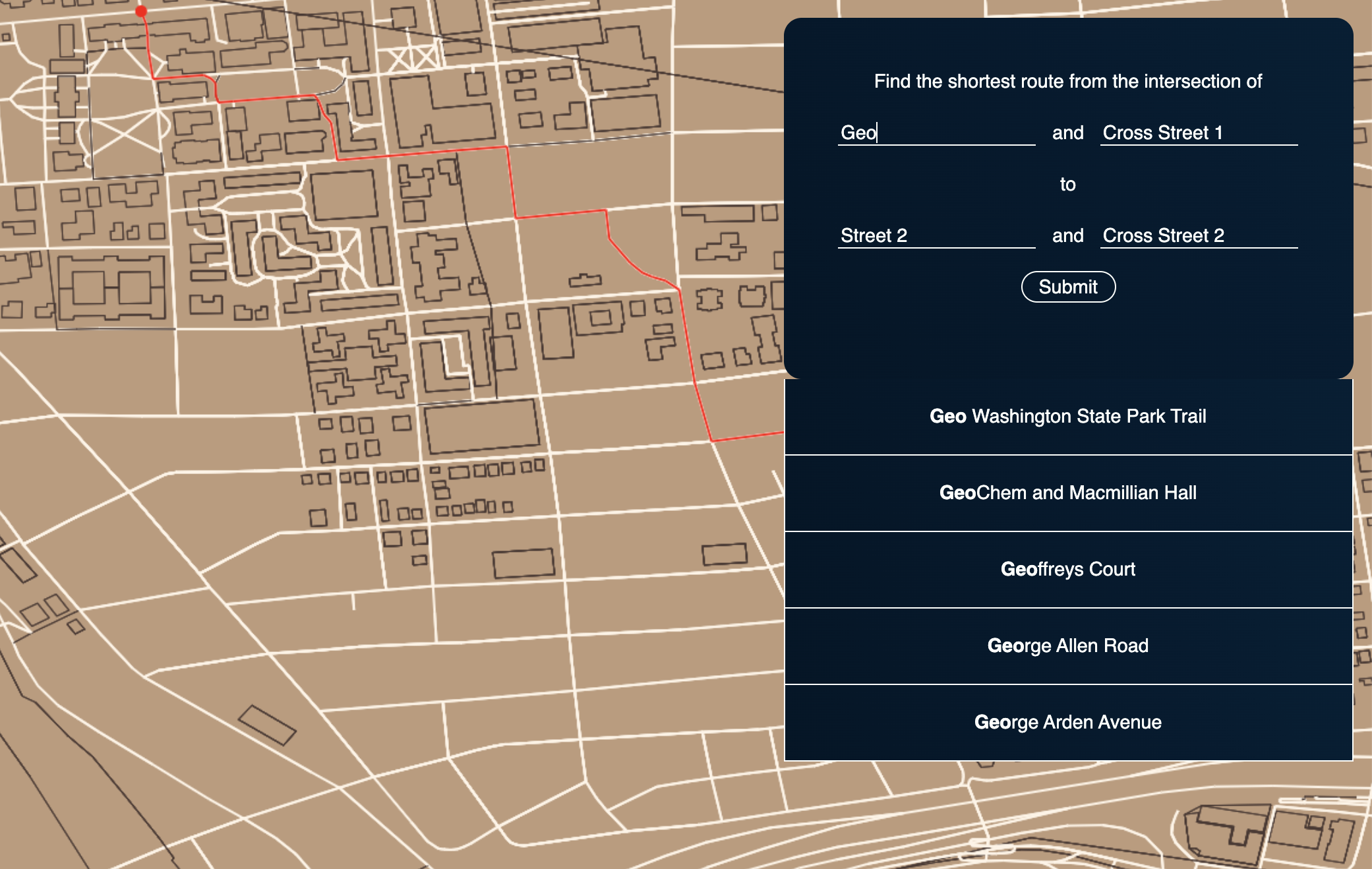
real-time autocomplete prompts the user as they type
Implementation and Backend
Due to the nature of this project, the files containing the data (Open Street Maps data) are quite large. The testing database was contained in a file that was over 500 megabytes, and as such, it was crucial to maximize the efficiency of querying and storing data. On the backend, I used hashmap caching to store data queried from the database so that the app would not need to query the same data multiple times. On the frontend, I used coordinate tiling so that only the data within the viewport would be queried and rendered, to maximize efficiency.
For nearest-neighbor search (finding the nearest traversable coordinate to any point in space), I used a KD Tree to keep track of the 3-dimensional coordinates to optimize this speed, which split the search space in half. Finding the shortest route was done using a modfied Dijkstra's algorithm that only queried data as necessary, and an A* search extension, which made the algorithm greedier and slightly faster. Since it is also necessary to account for the earth's curvature, I used the Haversine formula to account for edge weights.
This application was also extensively tested with JUnit tests and command line tests.
• • •
about me.
i'm a developer and designer pursuing an bachelor of sciences in computer science (with a focus on artificial intelligence & machine learning as well as visual computing) and a bachelor of arts in visual art at brown unviersity. i'm passionate about accessible, powerful, and innovative designs and products. below you can see some of my work experience and skills.
you can also find my resumé here.
work experience.
|
Project Manager & Developer UNICEF CBoard Fall 2020 - Present |
CBoard is an assistive technology solution that allows children with speech impairments to communicate Volunteered through Develop for Good to lead this project in coordination with United Nations International Children's Emergency Fund Managed 12 developers and designers in designing and building a Flutter native app for CBoard |
|
Software Engineer Pangea.app June 2020 - Present |
Redesigned and built v4 of React Native Mobile App and React Web App with team of 7 designers & developers Improved platform and drove > 40% increase in GMV each month Stack: React, React Native, JavaScript, Redux, ReQL |
|
Dev Team Lead Hack@Brown Fall/Winter 2020 |
Built Hack@Brown 2021 public facing website and virtual experience for hackers to interact with sponsors Managed and worked with 2 other co-leads and 10 developers Coordinated with design, sponsorship, and experience teams to make sure we were fulfilling their needs with our product |
|
Undergraduate Teaching Assistant Brown University Fall 2019 - Fall 2021 |
Fall 2019: Object-Oriented Programming, Introductory Course; Spring 2020: Discrete Structures & Probability in Computer Science; Fall 2021: UI/UX Design Part of a 45-person team assisting 400+ students in the largest course at Brown University Helped students debug code in 4 hours of one-on-one help each week, held two 10-student discussion sections and labs per week |
|
Junior API Developer Intern GPShopper Summer 2019 |
Built Apigee API Gateways and implemented transition from Forum Sentry Worked on feature releases for SDKs distributed to 10+ retail partners Implemented security protocols for secure Synchrony Financial bank data |
skills.
|
Areas of (Moderate) Expertise |
Full-Stack Web & Mobile App Development UI/UX Design Visual Computing AI/ML |
|
Programming Languages |
Python Java HTML/CSS React & React Native Flutter JavaScript PHP SQL C |
|
Design Software |
Figma Adobe CC Balsamiq Maya |
|
Cloud Computing |
AWS (RDS, Lambda, API Gateway) GCP (Kubernetes, Compute Engine) |
|
Spoken Languages |
English (Native Fluency) Mandarin (Conversational Fluency) Spanish (Intermediate) |
|
Interests |
Cooking Long-Distance Running Painting Guitar |